Category: Architecture (page 1 of 3)

First Street Parkade 50 Years Down

First Street Parkade construction

First Street Parkade

First Street Parkade

First Street Parkade demo

After fifty years of gracing Cedar Rapids’ downtown riverfront, the First Street Parkade and its iconic spiral ramp have reached their end. Built in 1961, the four-story ramp would provide over 400 parking spaces for patrons of the downtown retail scene, as competition from newer suburban outlets was increasing. In recent years the structure’s use would be dominated by daytime office workers.

When constructed the new parkade had a commanding presence downtown – few structures at that time occupied the entire length of a city block. Three elevations (north, east and south) that did not face the river were characterized by long, level horizontal planes, articulated by minimalist vertical supports. Along First Street, sections of the top deck wall were clad in dark tinted glass, perhaps an attempt to break up the non-varying facade to relate to the scale of existing storefront buildings across the street.

The river facade was much more dynamic. Angled ramps that let motorists ascend to the top deck were left undisguised, sloping in the same direction as river’s flow. The center was marked by an incredible spiral ramp, partially extending out over the water, cutting through the elegant balustrade lining the existing river wall. Exposed by the demolition process, the concrete spiral was self-supporting, cantilevering from the massive circular core.

While the spiral certainly added a point of visual interest along the river, more impressive was the experience driving down it, framing a sequence of views toward iconic public buildings like City Hall, the county courthouse, and the municipal greenspace of Mays Island. The orientation of views from the ramp reinforced long-standing symbols of civic pride. Likewise the parkade was a new point of pride for the city – a sign of modern progress and optimism for the future, heralded as a means to save downtown from its looming demise.

After the 2008 flood, replacing the First Street Parkade became more imminent, having already reached the end of its useful life. Once demolition is complete the site will be turned into surface parking for the time being – an acceptable temporary use. The important riverfront site is now ripe for redevelopment and, once again, has the opportunity to be a catalyst for downtown progress and civic pride for fifty more years to come. Only this time, it will be for people, not cars.

Alternative Design for St. Paul’s Church

Completed in 1914, the nearly century-old St. Paul’s Methodist Church in southeast Cedar Rapids is perhaps best known for being designed by famous architect Louis Sullivan, a fact that is only partially true. The actual built design was carried out by Chicago architect W.C. Jones, after Sullivan resigned in 1912, refusing to sacrifice ornamentation to keep within budget. Jones then altered Sullivan’s plans, mostly removing ornamentation, maintaining much of the original design. (St. Paul’s UMC)

Sullivan’s design, however, was not the only one considered for St. Paul’s new building. In 1909, the church purchased land at 3rd Ave. and 14th Street SE, and soon sent requests to several architects for competitive bids and plan proposals. One of these architects, evidently, was the Minneapolis firm of William Gray Purcell and George Grant Elmslie.

Active between 1907 and 1921, Purcell and Elmslie, was the second most commissioned firm of the Prairie School after Frank Lloyd Wright. (Wikipedia) Their design proposal to St. Paul’s Church included a perspective rendering, floor plan, and elevation drawing, seen below. The extent of detail is impressive for just a proposal and makes me curiosity about other proposals the church may have received.


Given Sullivan’s influence on the Prairie School, it’s not surprising that Purcell and Elmslie’s design for St. Paul’s was stylistically similar to Sullivan’s, both progressive and decidedly nontraditional. The new church site would have been at the edge of town at the time, arguably making the Prairie style even more fitting.

This make me wonder if St. Paul’s desired a modern new church, intentionally seeking out innovative architects for something different than the traditional archetype. Additionally it is just interesting to consider the entire process of the new building, something not often dwelled upon in architectural history. Perhaps more telling is, not what was actually built, but what could have been.

Images found at prairiestyles.com/lsullivan_comm.htm and organica.org/pejn86_2.htm

Library in the Park

New CRPL design

When it opens in summer 2013, the new Cedar Rapids Public Library will join the former Carnegie Library, the Museum of Art, the Gazette building, and First Presbyterian Church in surrounding the city’s signature downtown Greene Square Park, the long ago former site of the original Washington High School. Designed by OPN Architects, the new library replaces the flood damaged library on First Street, which was just two years shy of its 25th anniversary when the flood hit. The library had been gearing up for a major renovation and expansion project just before the flood.

In January 2009, FEMA declared the library building hit the 50 percent threshold, which meant FEMA would help fund total replacement of the current building instead of repairing it. Typically in this case, a new building must be located on the same site, but sitting less than a block from the riverbank seemed foolish so the city was able to get a variance to build at a new site. Over the next year and a half the merits of a new library and its location were hotly debated, among many other projects the city was charged with.

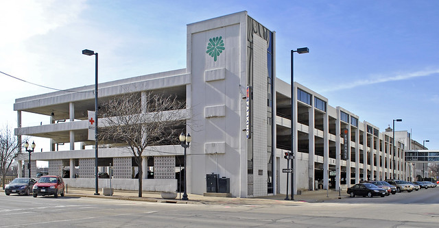
Three final sites were seriously considered: the TrueNorth block just south of Greene Square on 4th Ave. SE, the Emerald Knights site (between 1st and 2nd avenues SE, and 7th and 8th streets), and a last minute pitch for the existing Gazette/KCRG block (between 2nd and 3rd avenues SE, and 5th and 6th streets). Despite the board’s Emerald Knights recommendation, the City Council ultimately voted on Feb. 24, 2010, to build on the TrueNorth site, in anticipation of a new synergy of culture and community between the new library, the park, and the existing art museum. However this is no new concept for Cedar Rapids.

By the late 1960s, the Cedar Rapids Public Library was in dire need of addition space, despite two previous additions to the old Carnegie Library, which opened in 1905. A survey conducted in 1966 cited population growth, increase in circulation, and accessibility for needing an expanded library. The report, produced by University of Iowa Library School Director Fred Wezeman, concluded that a new library should be located in the central business district, should maximize area on the first floor, and be convenient to main traffic arteries and close to public transit. He also suggested the addition of a new west side branch library; a Kenwood branch already existed on the eastside which remained in operation until the mid 1990s. [1]

Brown, Healey and Bock Architects-Engineers was hired in 1968, to begin design work on a new library, initially anticipated to be built next to the existing Carnegie Library on 3rd Avenue SE across from Greene Square where the current Museum of Art now sits. [2] A year earlier, though, an idea was floated to incorporate a new library into a larger civic center project, proposed as the grand centerpiece of Cedar Rapids’ urban renewal in the area of the current US Cellular Center. (I’m currently researching the implications of the federal urban renewal program in Cedar Rapids…stay tuned.) The civic center had its own setbacks that ultimately led to a scaled-back project that did not include the library.

In March 1969, the library board unveiled a unique proposal to construct a new subterranean library underneath Greene Square Park. This was not the board’s final recommendation, just an idea. At this point the board was still considering building next to the existing library and another site at 200 First Street SE, the present-day site of the Alliant Energy Tower.

Architect Ted Healey is quoted in the Gazette as promoting the cost savings to heat and cool the underground library, as well as the city’s plans to construct a new parking ramp adjacent to Greene Square, across the 4th Street tracks on the former site of Union Station, regrettably torn down in 1961. From the Gazette: “According to initial plans, the library would be fronted by a pedestrian walkway sunken about 10 feet below ground level. Huge glass windows would present a view into the library.” [3]

1969 Greene Square Park library proposal

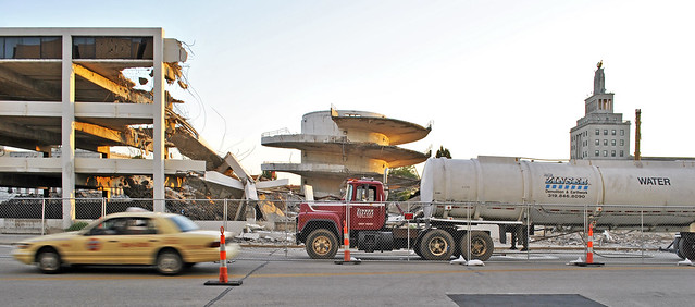
The drawing is oriented with north at the bottom so the existing Carnegie Library would be across the street (3rd Ave) at the bottom. It is difficult to discern where on the site plan the underground facility actually was to be. The large, oddly-shaped white space in the center must be the sunken plaza, but I’m unsure if the underground building is to the lower left corner or upper right corner. My suspicion is that it is to the upper right (I think the darker shading along the sunken plaza may be the “huge glass windows”), but that presents some new questions. The fan-shaped building in the upper right corner was already built five years earlier in 1964, housing a senior center – ultimately the only new structure built in Greene Square and torn down in early 2011.

According to a May 22, 1969, Gazette brief, the library board had still not decided between the Greene Square or 200 First Street SE (Alliant) location. It seems an addition to the existing Carnegie was no longer being considered. Either way a new library, to cost $2.7 million to construction, was contingent upon the passing of a bond election. [4]

A June 29, 1969, Gazette editorial seems to suggest the Greene Square proposal was the library board’s chosen site to move forward with, in a response to the Cedar Rapids Garden Club’s petition against the subterranean library plan. The garden clubs objected due to the loss of trees required for construction. The editorial board counters this argument by claiming a mere dozen trees out of more than thirty would need to be removed and that surely new plantings and landscaping would preserve the park. “There may be other reasons why a partly underground central library in Greene square is not the best solution to the city’s need for a new one, but the loss of greenery and tree destruction aren’t among the drawbacks that should be decisive.” [5]

Needless to say the sunken library was never pursued much further. The bond failed during a special election later that year, and again in March and November of 1973. In all three elections, a majority of voters voted yes, but did not achieve the state mandated 60 percent supermajority to pass. [6] Beyond this there is a gap in my research regarding further funding and development of the library. (CRPL’s free online archive of the Gazette seems to be missing 1977 – 2008.)

Ultimately a new 85,000 square-foot central library was built at 500 First Street. The new library celebrated its grand opening on February 17, 1985, and was located there until the flood three years ago, June 11-13, 2008. Designed by the same architects originally hired in 1968, the new building seemed to satisfy certain parameters set out in the 1966 library study. It was located near the downtown core, had a majority of public spaces on the ground level, and was conveniently accessibly both by car and by transit (a new Ground Transportation Center opened just a few years earlier across the street). Seen below is the library under construction in 1984.

Cedar Rapids Public Library construction 1984

The parti of this new library was a basic rectangle, fit to the downtown street grid, overlaid by an organizational axis shifted 45 degrees. A two-story high atrium bisected the building, connecting an entrance at the parking lot facing First Street and an arguably more urban entrance directly off of 5th Avenue. In the smaller corner created to one side of the atrium was a public auditorium opposite of the library. A partial second floor bisected the rectangle in the other direction (perpendicular to the atrium axis), which housed the children’s section on the library side, and offices in the smaller portion above the auditorium. The north portion of the building was mostly monolithic, clad in large textured concrete panels, with the southern portion wrapped in floor to ceiling windows, sheltered by the deep overhang of the waffle form concrete ceiling.

Interestingly, the new library now under development follows a strikingly similar conceptual parti, though articulated quite differently. At the most basic level, the new library will be a two-story rectangle with an atrium space separating a larger open stacks area from a smaller area housing admin functions and an auditorium. The stacks area is wrapped in glass, while the back of house portion is less open, but certainly not the solid mass of concrete that the 1985 building was. Obviously the two library designs are quite different; architecturally they are night and day, but certainly parallels do exist.

When completed in summer 2013, the new library will open up towards Greene Square, reactivating the fading park and creating a cultural gathering space, bound by the historic Carnegie and newer art museum on the opposite side. Greene Square could once again be the grand civic park Cedar Rapids so needs and deserves. And perhaps the library was always meant to be a part of that.

Citations
1. Cedar Rapids Gazette, Survey Says Library Expansion Urgently Needed, Jan. 21, 1968
2. Cedar Rapids Gazette, Select Architect to Design New Public Library, Aug. 21, 1968
3. Cedar Rapids Gazette, Propose Library Under Greene Square, March, 26, 1969
4. Cedar Rapids Gazette, Still Undecided On Location for Central Library, May 22, 1969
5. Cedar Rapids Gazette, Trees Kept, June 29, 1969
6. Cedar Rapids Gazette, Same Old Story, Nov. 8, 1973

Greene Square Building History

Greene Square Park

On Friday, New Years Eve, the city-owned building in Greene Square Park was demolished following years of poor maintenance and minor flooding in 2008. The building opened Sept. 14, 1964, as a Senior Citizens Center, and most recently had been used for the Green Square Meals program. The one-story, fan-shaped building sat at the southwest corner of Green Square and opened up on to the park with a low, overhanging zig-zag roof.

The building appeared dated both in upkeep and the design itself. Its removal will return Greene Square into an entire open block that will accommodate a visual and active connection with the future new Cedar Rapids Public Library to be built across the street along the park’s southern edge.

Green Square Park building demolition

While there is little to object with the demolition, it is important to note the building’s significance in local architectural history. It was designed by Cedar Rapids architect Ray Crites who had an influential career in Iowa and throughout the Midwest. His most renowned buildings were houses – two of which were his own located in Cedar Rapids – that were distinctive vertical and horizontal compositions engaging natural sites. His partnership firm Crites and McConnell also played a role in the design of C.Y. Stephens Auditorium at Iowa State in 1969.

Throughout the city’s history Greene Square has been a mainstay even while much in and around it has changed. At one time Greene Square included the old Washington High School, was next to the spectacular Union Station, and across from the original Carnegie Library. Washington closed in 1935 and was demolished in 1946 after a failed preservation attempt. Similarly Union Station was torn down in 1961 to make way for a parking garage, which remains today. The old Carnegie Library still stands and was incorporated into a new facility for the Cedar Rapids Museum of Art in 1989.

ARCH 403 Mid-Review

Arch 403 Mid Review 1 from Brady Dorman on Vimeo.

Ever wonder what an architecture school studio review is like? The video is of my studio group’s critique at today’s mid-review for 5th year comprehensive studio. As I’ve described in previous posts, we are designing a [hypothetical] velodrome in Boston. In the video one of my partners Jamin introduces our design at this point and then I elaborate on site design and our method to contextualize with the adjacent neighborhood and the city as a whole.

Our critics were three faculty members in the College of Design: Nadia Anderson, Ann Sobiech-Munson, and Dean Emeritus Mark Engelbrecht. I believe our review went quite well and provided valuable feedback for moving forward from this point. It is clear our next step will be to integrate a thoughtful structural system into our aesthetic gesture, which will better clarify building and technical specifications of the design.

Select comments from the critics:

“I think there’s something that’s really working about what you’ve presented here. It’s maybe not necessarily this as an aesthetic so much as some of your sensitivities to the human scale and the way that this form kind of responds to the things around it.”
         – Assistant Professor Ann Sobiech-Munson

“I think there’s a language that’s developed out of this that I really appreciate, the relationship between the building itself and the site around it…”
         – Assistant Professor Nadia Anderson

“I think it, for me, expresses this idea of speed and discipline very beautifully..so I’d be very interested to moving on, you can imagine the idea…”
         – Dean Emeritus Mark Engelbrecht

Visit our studio project blog to follow our design process.

Frank Lloyd Wright in Iowa

Frank Lloyd Wright's Stockman House in Mason City, IA

Today I went to see several Frank Lloyd Wright and Wright-inspired buildings in northern Iowa on a field trip for Dan Naegele’s FLW seminar course I am taking this semester. Our day trip took us to Mason City and Quasqueton.

We visited the Stockman House (photo above) in Mason City, which was an example of Wright’s $5000 “fire proof homes” concept, though this one was actually built of wood frame, not concrete, so it was not actually fireproof. It was moved from its original location back in the early 1990s to a site along Willow Creek, across the street from Rock Glen, an early 20th century housing development of Wrightian Prairie and Usonian style homes (though not designed by Wright himself). We walked along the creek, which was beautiful with the trees in the fall. Bob McCoy, a local FLW enthusiast showed us around and allowed us inside his own home, the Blythe Residence designed by Walter Burley Griffin, overlooking Willow Creek.

While in Mason City we also stopped by to see restoration work at the Park Inn Hotel, one of Wright’s only hotels, located in downtown across from the town square. Built around 1910, this building incorporated a hotel and a bank, and is thought to be a prototype for Wright’s much larger Imperial Hotel in Tokyo, which was demolished in 1962. I must say I was pretty impressed with Mason City, contrary to my previous judgement of the town based solely on the outskirts view from I-35.

In the afternoon we drove to Quasqueton, which I did not realize was so close to Cedar Rapids, located in Buchanan County not far from US 20. Near Quasqueton we visited the Lowell Walter House, also known as Cedar Rock, perhaps one of the more well-known Wright houses in Iowa. This is a Usonian house, designed with the most basic domestic needs in mind, at least in Wright’s view. Estimated to cost $5000, the total cost ended up being $150,000 – in 1950 dollars. Extraordinary cost overruns were evidently quite common for Wright, but his clients seemed to put up with him anyway. The Walter House also includes a boat house next to the Wapsipinicon River.

It was interesting to see a few of the several homes and buildings Frank Lloyd Wright designed in Iowa. The state actually has a considerable collection, and most in good condition as well. View my photos at the link below.

> Flickr: FLW in Iowa

Impression of Boston

Boston Harbor

Now online is a photo collection of my visit to Boston last month for a studio field trip. Boston was an incredible place to explore – in addition to seeing our project site in Cambridge (read my response to our site visit on our studio blog), highlights included the ICA, walking tours of MIT and Harvard, and a day trip to see Louis Kahn’s Exeter Library in New Hampshire. Most of all I enjoyed seeing the different neighborhoods and the diversity of historic and contemporary architecture Boston has to offer. My first time to the city, I found the modern financial district built within the confines of the historic winding street system particularly interesting.

Boston appeared to be a very clean and pleasant city, not quite like the other big cities I’ve been to on the East Coast. It felt rather low-key for such a large city, perhaps in part due a lack of congruency because of the harbor and the Charles River separating distinct areas. Also there is an overall scale to much of the city that provides for the human and pedestrian experience, rather than the automobile so familiar city noises of “hustle and bustle” seem to be mostly absent.

> Flickr: Boston trip photos

Schematic Design for Velodrome

Now in the third week of 5th Year comprehensive studio now, my section has been divided into teams of three and are studying the site and beginning to develop massing studies for the velodrome. I suppose we could refer to this as schematic design. The images above taken from Google Street View show our current project site, viewed from the road bounding it on the north and a panoramic view from across the Charles River to the south. Our site is located in across the road from a residential neighborhood sandwiched between the campuses of Harvard University to the west and MIT to the east. Across the river to the south is the campus and athletic facilities of Boston University.

Everyone seems to approach the design challenge from a different angle. Many have focused on creating a dramatic [curving] form evoking a sense of movement expressive of the velodrome program. Alternatively I am much more interested in context and how the building interacts with its surroundings and the existing urban pattern. I tend toward thinking of buildings as compositions of spaces and pieces that can offer human scale, rather than a singular form. Before pairing up we all developed massing studies individually.

One of my partners created an expressive curving mass with modeling clay, while mine were much more generic and planar, but attempted to respond to the surrounding site conceptually and practically. My model decisions were generally based on [preconceived] notions about how buildings should respond to supposed “urbanism” and how architectural elements can be used purposefully to announce entry and the program within. Shown below are my two models (top two) and my partner’s model at the bottom.

The floor plan shape of my first model draws from the curving form of the Charles River, visible in my previous “Mapping Conversations” diagram. The overall massing of the north facade is flat and rectangular, intended to relate to the street, anticipating urbanism. One corner is cut out, intended to be glazing, to announce the entry. A new open space along to river opens up along the southern curving facade. A pass-through is meant to improve access and encourage connectivity between the river and the residential neighborhood beyond. The separated portion was proposed to house administrative offices and other programs not directly related to the functioning of the velodrome. As I presented this option I quickly began to dismiss it, in favor of my second model. The shape, albeit representational of the river is frankly just awkward and provides no variation or interest in the vertical dimension. However, differentiating the street side versus the river side and the method of announcing entrances and circulation are concepts I carried through to the second iteration.

My second mass model was somewhat of a rejection of the general presumption of a curving form. Wanting to maintain the more regular “urban” edge along the street, I used straight facades and angular shapes all over instead of attempting to incorporate curves. I first embellished the announced entry at the same corner, now with a [glass] prow extending out that would act as architectural signage marking the signature point of arrival and circulation within. I stacked three basswood shapes to represent setbacks in the facade, but not necessarily floor plates throughout the building as it was interpreted. (Obvious a large open space would need to be carved out of the center for the velodrome arena.) The north facade along the street maintains consistent and could house the offices and administration functions on the upper level, providing variation and transparency. The river side is stepped back more, with shifted angles on the top that begins to subtly convey the rotational expression of the velodrome within.

The lowest basswood shape would be the entry level, raised above ground level parking underneath. An exterior terrace on the east end provides a clear entry condition. Vertical circulation (example: stairs or escalator) from the enclosed parking area up to the terrace would direct all spectators (those who arrive by car and those who walk, bike, or take transit) to the same main entrance. Of course there would be additional auxiliary entrances, but I think it’s important to provide the same arrival experience to those driving and those arriving and foot or bike. Not shown in the photos, but existent on the model as presented was a piece of paper representing a new at-grade plazascape along the east side that connects the street [and neighborhood] to the river and accommodates large crowds during events.

A significant critique by my peers was that this form, at least as modeled, is too arbitrary and could easily be any other program. I would agree, but believe a more expressive building form could still be developed without the use of curves.

The last photos are of the curving mass model that my partner created out of clay. It is certainly expressive of the velodrome’s essence of movement and rotation, and begins to consider an entry condition with a ramping platform wrapping around the river side, which he imagined as the “front” and primary entry point.

Our two models appear to be completely contradictory of each other, but it is now our task to attempt to integrate the aesthetic, contextual, and conceptual ideas embodied in each. I expect to concede to a more curved, visually expressive form, but am determined it will be a composition and not a singular form alone. As I realized in my first model, it is challenging to integrate curved and angular forms and avoid an uncomfortable juxtaposition. But additionally, as I investigate our site and its context further, my original notions about an “urban” response may not be appropriate. In fact, opposite of our site (across the street) is a very low, sprawling middle school that hides from the street behind fencing and a dense layer of trees and overgrown vegetation. The road is busier than an urban street but not quite a highway. The most pedestrian-feeling corner is to the northwest and characterized by a filling station with an amusing oversized Shell sign.

How to connect to urban grid of residences blocked by the middle school and the two universities beyond will be a challenge, but a better focus than blind assumptions about a street necessarily being “urban”. Reasonably accommodating 12000 spectators as the project [ridiculously] demands with minimal parking and no immediate transit connection must drive the notion of context that informs an architectural expression that embodies the spirit and essence of competitive cycling.

Language of Architecture

As an initial exercise in this first week of comprehensive studio we were charged with writing a critical response to a 2008 Charlie Rose interview with four of today’s leading architects, regarding the way they talk about architecture and the kind of vocabulary they use. The ways architecture is discussed amongst the general public, within the profession, and between the two groups is an interesting study. My response follows:

In Charlie Rose’s hour-long interview with four Pritzker Prize laureates – Jean Nouvel, Zaha Hadid, Frank Gehry, and Renzo Piano – they all speak about architecture as an exploratory process, an adventure of making space in reality and enhancing a contextual dialogue with place. They use expressive words to describe not-only the physical qualities of architecture, but the process, tectonics, and especially relational qualities as well.

As a means of creating architecture, all four agreed on the need for parameters and, similarly, a partner in design – a client. The notion of complete design freedom was not comprehended as a virtuous, or a plausible condition. Through practical criterion and vision of the client [typically], the program is applied and the architectural idea must be maneuvered in, according to Zaha, which challenges creativity. There also needs to be a strategy or vision with civic projects.

This challenge of sustaining an idea through layers of restraint provides direction for realizing and expresses meaning behind an architectural conclusion. For this reason, “clone architecture” is not valued because they often don’t respond to their contextual surroundings.

Interestingly, much of the discussion examines cities and designing new architecture in the urban context. These individuals are often criticized for their buildings because they look different and are unlike most buildings we are used to. How to build relationship with existing buildings without simply reproducing it, is critical to them, which Jean Nouvel expressed almost immediately in the conversation.

Perhaps the most profound difference between architects and non-architects – or, rather, good architects versus bad ones – is their comprehension of building and site relationships without direct interpretation of what is already made.

Renzo Piano speaks romantically of the cities in Italy, made up of layers as if naturally. He sees architecture as fragments of cities, which can provide a diverse context to build upon. Context is beneficial to build from, forcing the design to focus on a smaller angle, assembling a more intense architectural expression. An alliance of time and space stimulates imagination of a building’s enfilade of space, mediating the user experience through architecture. Cinematic influence was especially powerful for Nouvel. The implication of light and space is the tangible language of architecture.

Sustainability was talked about not only in terms of environmental and energy conservation, but livability, social implications and spatial quality as well. Frank believes the mantra of sustainability can be greatly misused to promote a false architectural regard. Zaha continues, that sustainability is ultimately to do with the way space is made and advancements in environmental systems cannot be the sole merit of a building’s essence. Renzo argues that buildings need to breathe and work with the earth.

Good architecture is the exception, despite much contemporary building activity says Frank. “There are very few people like us,” contending their work is not making an impact since the vast majority of new architecture lacks greatness or validity by some standards. The consistency for great buildings is limited because we allow [“bad”] architecture to happen and put up with it.

How to be bold and create a meaningful architecture that is also engaging to the public and societal context, so it may be accepted and celebrated, is the challenge I take away from this discussion. Their focus on civic conditions inspires my thought for designing architecture, regardless of its program, that will be dynamic, respectful, and uplifting to the identity of the city.

Rawn Architecture

The new US Courthouse under construction in downtown Cedar Rapids was designed by OPN Architects and William Rawn Associates of Boston, Massachusetts. William Rawn is a very distinguished architect, considered one of the top architects in the country with countless awards and honors to reference. Despite his wide scope of work including several well-known and prominent buildings, he seems to be more modest and understated than other prominent architects who have attained fame outside of the industry for their signature design pedigrees.

William Rawn Associates is a surprisingly small firm with just over 30 professionals, with an impressive portfolio. Since discovering the firm I have always had an appreciation for their work. Clarity of design and attention to materiality and details sets the firm apart. I really enjoy the way wood is used in so many of their proejcts, especially in the form of horizontal slats for sun shading or screening. These will be incorporated into Cedar Rapids’ new courthouse for sun screening and aesthetics purposes in the courtrooms.

Below is a link to an article from last year in the Boston Globe profiling William Rawn and his impressive career. He designs beautiful buildings that also function well and serve the client’s needs. Cedar Rapids is fortunate to have Rawn collaborating on such an important new building.

> Boston Globe: The Architecture of William Rawn
> William Rawn Associates

Older posts

© 2022 URBAN THINKING

Theme by Anders NorenUp ↑