Category: Studio (page 1 of 3)

Lucy House Excerpt

Lucy House

Today I discovered an excerpt of an “11×17” precedent study I made back in second year studio (Arch 201, Fall 2007) about the Rural Studio’s Lucy House used on Judit Bellostes’ blog. A few sketch diagrams of mine are used to describe the Lucy House in a post about Marjetica Potrč’s 2007 installation at Gallerie Nordenhake in Berlin, which was a recreation of the home’s tornado shelter (“tower of power”).

> Judit Bellostes : Lucy House – Tornado Shelter (translated from Spanish)
> Lucy House precedent study, by Brady Dorman

ARCH 403 Mid-Review

Arch 403 Mid Review 1 from Brady Dorman on Vimeo.

Ever wonder what an architecture school studio review is like? The video is of my studio group’s critique at today’s mid-review for 5th year comprehensive studio. As I’ve described in previous posts, we are designing a [hypothetical] velodrome in Boston. In the video one of my partners Jamin introduces our design at this point and then I elaborate on site design and our method to contextualize with the adjacent neighborhood and the city as a whole.

Our critics were three faculty members in the College of Design: Nadia Anderson, Ann Sobiech-Munson, and Dean Emeritus Mark Engelbrecht. I believe our review went quite well and provided valuable feedback for moving forward from this point. It is clear our next step will be to integrate a thoughtful structural system into our aesthetic gesture, which will better clarify building and technical specifications of the design.

Select comments from the critics:

“I think there’s something that’s really working about what you’ve presented here. It’s maybe not necessarily this as an aesthetic so much as some of your sensitivities to the human scale and the way that this form kind of responds to the things around it.”
         – Assistant Professor Ann Sobiech-Munson

“I think there’s a language that’s developed out of this that I really appreciate, the relationship between the building itself and the site around it…”
         – Assistant Professor Nadia Anderson

“I think it, for me, expresses this idea of speed and discipline very beautifully..so I’d be very interested to moving on, you can imagine the idea…”
         – Dean Emeritus Mark Engelbrecht

Visit our studio project blog to follow our design process.

Impression of Boston

Boston Harbor

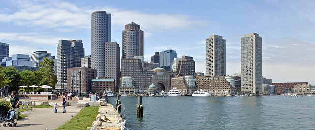
Now online is a photo collection of my visit to Boston last month for a studio field trip. Boston was an incredible place to explore – in addition to seeing our project site in Cambridge (read my response to our site visit on our studio blog), highlights included the ICA, walking tours of MIT and Harvard, and a day trip to see Louis Kahn’s Exeter Library in New Hampshire. Most of all I enjoyed seeing the different neighborhoods and the diversity of historic and contemporary architecture Boston has to offer. My first time to the city, I found the modern financial district built within the confines of the historic winding street system particularly interesting.

Boston appeared to be a very clean and pleasant city, not quite like the other big cities I’ve been to on the East Coast. It felt rather low-key for such a large city, perhaps in part due a lack of congruency because of the harbor and the Charles River separating distinct areas. Also there is an overall scale to much of the city that provides for the human and pedestrian experience, rather than the automobile so familiar city noises of “hustle and bustle” seem to be mostly absent.

> Flickr: Boston trip photos

Boston

We are traveling to Boston tomorrow through Monday for studio, to visit our project site for the velodrome and experience the great architecture and urbanism the city has to offer. I have never been to Boston before so am really looking forward to it. Our studio progress is going well. I set up a collaborative blog at isuvelodrome.wordpress.com for my project team to document our process and self-critique as a way to keep progressing and clarify the expression of our design. I’ll post more about the trip upon our return.

Schematic Design for Velodrome

Now in the third week of 5th Year comprehensive studio now, my section has been divided into teams of three and are studying the site and beginning to develop massing studies for the velodrome. I suppose we could refer to this as schematic design. The images above taken from Google Street View show our current project site, viewed from the road bounding it on the north and a panoramic view from across the Charles River to the south. Our site is located in across the road from a residential neighborhood sandwiched between the campuses of Harvard University to the west and MIT to the east. Across the river to the south is the campus and athletic facilities of Boston University.

Everyone seems to approach the design challenge from a different angle. Many have focused on creating a dramatic [curving] form evoking a sense of movement expressive of the velodrome program. Alternatively I am much more interested in context and how the building interacts with its surroundings and the existing urban pattern. I tend toward thinking of buildings as compositions of spaces and pieces that can offer human scale, rather than a singular form. Before pairing up we all developed massing studies individually.

One of my partners created an expressive curving mass with modeling clay, while mine were much more generic and planar, but attempted to respond to the surrounding site conceptually and practically. My model decisions were generally based on [preconceived] notions about how buildings should respond to supposed “urbanism” and how architectural elements can be used purposefully to announce entry and the program within. Shown below are my two models (top two) and my partner’s model at the bottom.

The floor plan shape of my first model draws from the curving form of the Charles River, visible in my previous “Mapping Conversations” diagram. The overall massing of the north facade is flat and rectangular, intended to relate to the street, anticipating urbanism. One corner is cut out, intended to be glazing, to announce the entry. A new open space along to river opens up along the southern curving facade. A pass-through is meant to improve access and encourage connectivity between the river and the residential neighborhood beyond. The separated portion was proposed to house administrative offices and other programs not directly related to the functioning of the velodrome. As I presented this option I quickly began to dismiss it, in favor of my second model. The shape, albeit representational of the river is frankly just awkward and provides no variation or interest in the vertical dimension. However, differentiating the street side versus the river side and the method of announcing entrances and circulation are concepts I carried through to the second iteration.

My second mass model was somewhat of a rejection of the general presumption of a curving form. Wanting to maintain the more regular “urban” edge along the street, I used straight facades and angular shapes all over instead of attempting to incorporate curves. I first embellished the announced entry at the same corner, now with a [glass] prow extending out that would act as architectural signage marking the signature point of arrival and circulation within. I stacked three basswood shapes to represent setbacks in the facade, but not necessarily floor plates throughout the building as it was interpreted. (Obvious a large open space would need to be carved out of the center for the velodrome arena.) The north facade along the street maintains consistent and could house the offices and administration functions on the upper level, providing variation and transparency. The river side is stepped back more, with shifted angles on the top that begins to subtly convey the rotational expression of the velodrome within.

The lowest basswood shape would be the entry level, raised above ground level parking underneath. An exterior terrace on the east end provides a clear entry condition. Vertical circulation (example: stairs or escalator) from the enclosed parking area up to the terrace would direct all spectators (those who arrive by car and those who walk, bike, or take transit) to the same main entrance. Of course there would be additional auxiliary entrances, but I think it’s important to provide the same arrival experience to those driving and those arriving and foot or bike. Not shown in the photos, but existent on the model as presented was a piece of paper representing a new at-grade plazascape along the east side that connects the street [and neighborhood] to the river and accommodates large crowds during events.

A significant critique by my peers was that this form, at least as modeled, is too arbitrary and could easily be any other program. I would agree, but believe a more expressive building form could still be developed without the use of curves.

The last photos are of the curving mass model that my partner created out of clay. It is certainly expressive of the velodrome’s essence of movement and rotation, and begins to consider an entry condition with a ramping platform wrapping around the river side, which he imagined as the “front” and primary entry point.

Our two models appear to be completely contradictory of each other, but it is now our task to attempt to integrate the aesthetic, contextual, and conceptual ideas embodied in each. I expect to concede to a more curved, visually expressive form, but am determined it will be a composition and not a singular form alone. As I realized in my first model, it is challenging to integrate curved and angular forms and avoid an uncomfortable juxtaposition. But additionally, as I investigate our site and its context further, my original notions about an “urban” response may not be appropriate. In fact, opposite of our site (across the street) is a very low, sprawling middle school that hides from the street behind fencing and a dense layer of trees and overgrown vegetation. The road is busier than an urban street but not quite a highway. The most pedestrian-feeling corner is to the northwest and characterized by a filling station with an amusing oversized Shell sign.

How to connect to urban grid of residences blocked by the middle school and the two universities beyond will be a challenge, but a better focus than blind assumptions about a street necessarily being “urban”. Reasonably accommodating 12000 spectators as the project [ridiculously] demands with minimal parking and no immediate transit connection must drive the notion of context that informs an architectural expression that embodies the spirit and essence of competitive cycling.

Mapping Conversations

This semester our 5th Year Architecture comprehensive studio project is for a 12,000-seat velodrome (an indoor competitive cycling track) in Cambridge, Massachusetts, on an open site along the Charles River that is currently used for athletic fields. During the first week we were challenged to choose a past theme from Cabinet Magazine, from which to construct a conceptual frame and thesis relating to the discipline of architecture, the City of Boston, and competitive cycling. I was quickly drawn to the Spring 2001 issue theme, “Mapping Conversations” and became even more intrigued upon reading its features.

In Frances Richard’s article Utterance is Place Enough she explores what maps are and how we create and use them to define our places and communication spatial comprehension (directions perhaps). Mapping is a method for articulating the existing of things in our physical environment – by showing them on a map, it establishes their importance or permanence. In regard to conversation, it is abstracted as an unscripted verbal exchange between two or more participants. Since it is unpredictable and not pre-established, conversation is not permanent in the way things and places are in space, rather it is a temporary discourse. Continuing, how is mapping conversation different from writing? Richard argues maps and writing are artifacts experienced once removed, whereas conversation is experienced up front and necessarily interactive.

Mark Lombardi created “narrative structure” drawings using lines and notations to index or “map” discourse between political and financial leaders to expose fraud and abuse of powers. Warren Sack looks at mapping very large-scale conversations through the contemporary medium of the internet. Historically mass conversation took place in large-scale public spaces, but the internet can reach a much greater audience with anonymity, but also allows for more direct feedback or discourse. Sack looks at social media networks, “mass media,” and other digital dialogue, using several different kinds of graphs and charts to establish themes and comprehension of these large-scale conversations.

From these articles, which I admittedly summarized pretty poorly, I took the mapping aspect and began to consider the different kinds of actual, spatial, and conceptual conversations active in Boston that would or could in some manner contribute to or have an effect on the proposed velodrome. Utilizing the colors of Boston’s subway lines, I devised five different categories or layers of “conversation” to be represented. Particular institutions and places are mapped geographically, which are significant participants in their given color-coded conversation. Then I was able to create a framework for the design of the velodrome and how it will engage and contribute to these conversations currently taking place in the city. I often use word diagrams, arrows, and notations to organize and plan out objective and key components of a design or piece of writing, so this was actually a very constructive exercise for me.

1. Influence of significant educational institutions nearby (Red)
2. Consideration for public space (Blue),
3. Impact of other athletic facilities and traditions in Boston (Green)
4. Transport and physical connectivity to different parts of Boston (Orange)
5. Contextual relationship with existing urban pattern and significant architecture (Silver)

Mapping Conversations by Brady Dorman

Language of Architecture

As an initial exercise in this first week of comprehensive studio we were charged with writing a critical response to a 2008 Charlie Rose interview with four of today’s leading architects, regarding the way they talk about architecture and the kind of vocabulary they use. The ways architecture is discussed amongst the general public, within the profession, and between the two groups is an interesting study. My response follows:

In Charlie Rose’s hour-long interview with four Pritzker Prize laureates – Jean Nouvel, Zaha Hadid, Frank Gehry, and Renzo Piano – they all speak about architecture as an exploratory process, an adventure of making space in reality and enhancing a contextual dialogue with place. They use expressive words to describe not-only the physical qualities of architecture, but the process, tectonics, and especially relational qualities as well.

As a means of creating architecture, all four agreed on the need for parameters and, similarly, a partner in design – a client. The notion of complete design freedom was not comprehended as a virtuous, or a plausible condition. Through practical criterion and vision of the client [typically], the program is applied and the architectural idea must be maneuvered in, according to Zaha, which challenges creativity. There also needs to be a strategy or vision with civic projects.

This challenge of sustaining an idea through layers of restraint provides direction for realizing and expresses meaning behind an architectural conclusion. For this reason, “clone architecture” is not valued because they often don’t respond to their contextual surroundings.

Interestingly, much of the discussion examines cities and designing new architecture in the urban context. These individuals are often criticized for their buildings because they look different and are unlike most buildings we are used to. How to build relationship with existing buildings without simply reproducing it, is critical to them, which Jean Nouvel expressed almost immediately in the conversation.

Perhaps the most profound difference between architects and non-architects – or, rather, good architects versus bad ones – is their comprehension of building and site relationships without direct interpretation of what is already made.

Renzo Piano speaks romantically of the cities in Italy, made up of layers as if naturally. He sees architecture as fragments of cities, which can provide a diverse context to build upon. Context is beneficial to build from, forcing the design to focus on a smaller angle, assembling a more intense architectural expression. An alliance of time and space stimulates imagination of a building’s enfilade of space, mediating the user experience through architecture. Cinematic influence was especially powerful for Nouvel. The implication of light and space is the tangible language of architecture.

Sustainability was talked about not only in terms of environmental and energy conservation, but livability, social implications and spatial quality as well. Frank believes the mantra of sustainability can be greatly misused to promote a false architectural regard. Zaha continues, that sustainability is ultimately to do with the way space is made and advancements in environmental systems cannot be the sole merit of a building’s essence. Renzo argues that buildings need to breathe and work with the earth.

Good architecture is the exception, despite much contemporary building activity says Frank. “There are very few people like us,” contending their work is not making an impact since the vast majority of new architecture lacks greatness or validity by some standards. The consistency for great buildings is limited because we allow [“bad”] architecture to happen and put up with it.

How to be bold and create a meaningful architecture that is also engaging to the public and societal context, so it may be accepted and celebrated, is the challenge I take away from this discussion. Their focus on civic conditions inspires my thought for designing architecture, regardless of its program, that will be dynamic, respectful, and uplifting to the identity of the city.

Umbria Trip

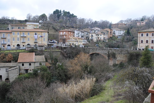
Hillside dwellings

Last weekend was full of travel. Last Thursday to Friday (Feb 4-5) we had a short overnight class trip to Perugia, Umbria, followed by a three day weekend for travel on our own. I headed up to Norway with three others and it was a blast, but I’ll talk about that in my next post.

We left Rome around 8am on Thursday aboard a double decker charter bus, which was kind of fun. It was my first time out of the city since arriving about a month ago, so I was looking forward to seeing the countryside and just somewhere else besides Rome.
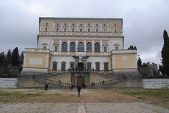
Palazzo Farnese in CaprarolaOn the way to Perugia we made a few side stops along the way. First in the small hill town of Bagnaia to visit Villa Lanta (16th century) with an elaborate formal garden with fountain and water features flowing down the hill above the town. We stayed there for a little over an hour to explore and do some sketching. Our second stop was at Palazzo Farnese (photo to left), an enormous 16th century mansion in a very rural town Caprarola. Similar to Villa Lanta, it sat above overlooking much of the small town. On the short walk from the bus we had majestic views of the deep valleys and hillside dwellings (photo at top). We only went through one floor of the Palazzo, which were all elaborately decorated with frescos painted on just about every wall and ceiling surface. Then we made a quick stop nearby for food tasting of a few different local foods, wines, and naturally carbonated water.

The next leg of the bus trip was longer, going through very hilly and forested areas. The road had very sharp turns, switching back and forth up and down terrain. The countryside was beautiful and a nice change of scenery from the dense grittiness of Rome. Despite winter, much of the ground was still mostly green.
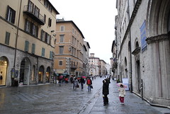
_DSC0123.JPGWe arrived in Perugia around 5:30pm, just as it was getting dark. Outside of town there were occasional small industrial buildings along the highway. Entering the city was actually quite sudden. I was surprised by the size and modernity of the newer areas, with more towers, glass and steel than can be found in Rome. But this certainly did not characterize all of Perugia, which originated as a medieval fortress atop a hill. The old historic center remains a vibrant place, connected to the newer city below by MiniMetro, an automated people mover system, as well as an extensive escalator corridor going up the hill.

A wide pedestrian street Corso Vannucci at the top is flanked by several tiny “streets” that crawl up and down the terrain, winding around agglomerations of buildings. Unlike most of the medieval streets in Rome, the majority of these were completely inaccessible except on foot, many only a meter or so wide. A lot were also built over, either partially or completely, making the typical meaning of street even more inapplicable. They were very foreign, especially since they are all still functioning, providing access to operating businesses and residences. The multidimensional, multilayered urbanism here simply cannot be found in America.
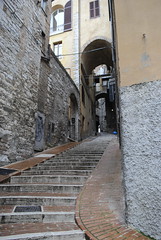
StreetHilltop Perugia was very posh with several stylish outlets along Corso Vannucci. It was very clean compared to Rome and the small side streets were very well lit. The paving material was also a lighter stone and brick compared to the standard dark gray cobblestone used most everywhere in Rome.

Our hotel (Hotel Priori) was just off Corso Vannucci on one of these side streets. That evening we had a group dinner with all students and professors at All Mangiar bene (translates: “All Eating Well”) located down one of the side vias. It was a multi course Italian dinner with two appetizers, soup, spaghetti, salad, turkey dish, pork chops and sausage; followed by dessert, coffee, and a lemon liquor. Needless to say, it was intense and very filling. A brick arched ceiling characterized the dinning room, with only a few small windows at one end, giving it a very medieval, almost dungeon-like vibe.

The following day on Friday was left for exploration and sketching. I walked down the hill first to find the train station with a few friends who needed to catch a bus there later to get to their own weekend travels. I then wandered around the modern city around and took the MiniMetro back up to the top. It was drizzly, gloomy and cold that day so everyone was pretty much ready to leave when we the bus came back around 3pm. The bus trip back to Rome was pretty uneventful with one quick stop at an AutoGrill truck stop. Back in Rome it was pouring rain, not making for a fun way back to the apartment. We were dropped back off at the Piramide Metro station where we had met the bus on Thursday, despite driving right by the apartment where the majority of us live. Waiting ten minutes in the pouring rain for a local bus to come was no fun at all, but hey, its Rome.

Perugia was a nice short trip outside of Rome and neat to see a smaller Italian city. See photos here.

Frugal Architecture

This past week I, along with ten or so other classmates, participated in the For a Frugal Approach in Architecture International Symposium and Design Workshop, sponsored by the Bruno Zevi Foundation. The focus was frugality in architecture, specifically for post-disaster emergency housing. The symposium started on Thursday (Jan 21) with a day of lectures from a number of international leaders in the field, including Nina Maritz (Namibia), Jorge Mario Jauregui (Brazil), Giorgio Goffi (taly), Sarah Wigglesworth (UK), Eko Prawoto (Indonesia), and Danny Wick from Auburn’s Rural Studio in Alabama.

It was held at the Citta’ dell’Altra Economia (“City of the Other Economy”), a part of an old slaughterhouse complex converted into exhibition and meeting space “for the promotion of the economy” related to agriculture, trade, and renewable energy, etc. It was a neat conversion but for this event the space was a bit too small (not enough seats) and did not seem to be heated. Logistics of the event was interesting since every speaker had to be followed by a translation between Italian and English. It also started at least half an hour late and presenters tended to go over their allotted time amounts – but punctuality certainly doesn’t seem to be common in Italy. Admittedly the whole day seemed to drag on, but I particularly enjoyed Giorgio Goffi’s work, and Danny Wick’s presentation on the Rural Studio was especially interesting.

On Friday we met at the Faculty of Architecture (department of architecture) at Sapienza University in Rome for the design workshop. American students from Northeastern University and Roger Williams University also participated. We were each paired with an Italian student to design a proposal for an emergency housing unit for the Abruzzo region near L’Aquila in response to the April 2009 earthquake there. We began at 9am and had until 7pm to finish, which ended up being extended to 8. The night before I had familiarized myself with the Abruzzo area and the extent of the disaster. My partner Marcella came with a basic design layout and some thoughts on materials, so we just built off of that. The language barrier was at times challenging (we referred to Google Translate on occasion) but she spoke English pretty well so it wasn’t really a problem.

We decided on a fairly simple L-shape with a half courtyard space in the SW corner. Each adjacent dwelling was set back halfway from the previous to permit ample direct sunlight to the courtyard windows for solar heat gain in the winter. For the east and west walls we decided to use thick stone walls (available from building rubble) to create thermal masses that could absorb solar heat during the day to be redistributed during the cooler night. There were some issues we didn’t get clarified and were not optimal for environmental conditions. My partner told me most of their curriculum is design-based and didn’t really have classes on building tectonics or passive design for environmental controls. It was a nice realization of how much I have actually learned at Iowa State about not only design, but also how buildings go together and how to harmonize them with environmental conditions.

Some of the architects who spoke the day before came for a while and walked around to check on the progress. Nina Maritz talked to us earlier on when we were still clarifying specifics of materials and orientation. Later one Giorgio Goffi stopped by, but only spoke in Italian. He had suggested considering our L-shape as a starting point and how they could be used to create a variety of different sizes and forms. This was not a bad idea, but it made it more difficult to clarify specific decisions regarding solar orientation, tectonics, and of course organization. We attempted to show both ideas – the variation that Goffi suggested, and the more specific possibility of one L. However the new abstract L variety got rid of the original relationship between adjacent units, making several material and orientation decisions less significant. In the end we sort of ran out of time and had a less than stellar presentation – we both agreed it was not good graphically and did not represent our ideas well. But we discussed a lot of interesting strategies during the day, so it was a really good learning experience.

The program wrapped up Saturday morning with visual presentation of the proposals and discussion from the panel of speakers. Unfortunately it was extremely unorganized with slides out of order and starting half hour to an hour later than scheduled. The discussion was interesting and informative, but like many professors and experts, almost everyone had to get the last word in, even if it was simply to agree with and over reiterate someone else’s point. Following the discussion orderves and champagne was served in a small courtyard next to the auditorium, so all was good.

Overall “Frugal Architecture” was exhausting, but a great experience. Getting insight into architectural education in Italy and the different perspectives and approaches the students bring was extremely valuable. It was also a terrific opportunity to challenge my own communication skills and knowledge of architectural and environmental systems.

First Day of Class at Palazzo Cenci

Monday, Jan. 11 – Today was the start of semester classes in Rome. We meet at Palazzo Cenci, a fairly significant 16th century building at Piazza delle Cinque Scole (five schools), where ISU College of Design has space on an upper floor. It is just across the river from Trastevere where my apartment is, in the former Rome Jewish ghetto. (See walking route to studio here.) We began at 9:30 with a brief orientation.

On the walk there I stopped with my friend Jenna at a coffee bar on Isola Tibenna (Tiber Island). The coffee bars in Rome are tiny bars where people come in and drink and eat quickly standing up at the bar and then go on their way. The coffee comes in very small cups. At this particular bar, you pay first at the cashier and take your receipt to the bar. I was unsure how what to say, so I requested the same thing as Jenna ordered before me – espresso e cornetto (crossaint) – for €1.80. At the bar the barista asked if I wanted cioccolato (chocolate) or creme (cream). I asked for creme. Now I know the next time to order cappuccino e uno cornetto.

Following orientation we broke for lunch. I walked up to Corso Vittorio Emanuele II (the busier street with the cellphone store) and had a panini and Coke for €3.70. It was fun to be able to try out the few new words I pick up each day. I went to pay and told the cashier I had a “panino e Coca-Cola.” (Amazing, right?)

Back to studio we had a drawing lecture from a faculty member from Ames, then broke into our studios. My studio met in a back room with access to the terrace. We spent the remainder of the day experimenting with different grades of charcoal and other drawing mediums. At the end of the day our instructor Chris took us on a short walk around a few nearby blocks pointing out some noteworthy places and amenities.

On the way home I stopped back at Panella (the first supermarket I went to on day 2) just off Viale di Trastevere (street), to pick up a bottle of bianco vino for the evening and some more pasta sauce for good measure. Once I got back to our apartment I passed the old woman who seems to be sitting at a corner near a vending machine all day everyday. I greeted her “Buona sera” (good evening) and she responded with a smile. Around the corner an old man greeted me and we had a brief conversation. He spoke little English but asked my age and if I was a university student. “” and “Buona sera.”

For dinner another friend made salad and manicotti with the remaining lasagna ingredients from last night. Tomorrow is supposed to be at least partially sunny so I hope to take some photos of the neighborhood and studio. For class we have a language course and another drawing session.

Older posts

© 2022 URBAN THINKING

Theme by Anders NorenUp ↑