I returned last Tuesday from a week in the Washington, DC, area. My friend Cece and I went to visit another friend Spencer, who goes to school there. This was my fifth time to the nation’s capital, while it was Cece’s first, so it was a good mix of seeing different neighborhoods and the obligatory museums and monuments.
We flew into BWI Wednesday, Aug 5, and took the MARC Penn Line to Union Station in downtown Washington. All previous times visiting I’ve flown into Reagan National Airport, which is literally across the river from DC, in Virginia. It has Metro service on the Blue line so getting into the city is a breeze. From BWI, we first had to take a shuttle bus to a remote parking garage where the MARC stop was at. Then we waited about twenty minutes for the train; meanwhile a few Amtrak Acela trains zoomed through. It look 30-40 minutes to get to Union Station in DC. Our first day was spent just walking around downtown and the Mall area.
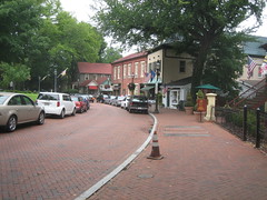
 The next two days, Spencer had reserved a Zip Car, so we ventured into Maryland and Virginia, far beyond the Metro lines. On Thursday we drove to Annapolis and spent a few hours exploring the historic capital city and enjoyed a delicious lunch at a local seafood restaurant, Backyard Bar & Grill. Annapolis is a beautiful place with brick everywhere. The scale and density of buildings in the city’s historic center is so unusual compared to what is typical in much of the country, particularly outside the east coast. On Friday we went to Shenandoah National Park in Virginia, where we took a nine mile hike up Old Rag Mountain.
Saturday morning we spent a couple hours at museums and the National Mall. In the afternoon we had a corn party grill out at a townhouse in Georgetown where a friend of Spencer’s was getting ready to move out of. It wasn’t “Iowa sweet corn from the back of a pickup truck” but it was good nonetheless. On our walk back to GWU, we passed through the new Georgetown Waterfront Park, along the Potomac River that most recently was used for parking lots. It was refreshing to see a modern, urban park in Washington, where most public spaces are decidedly more formal.
That evening we went to a Nationals Game at their brand new stadium on South Capitol Street by the Anacostia River. I’m normally not a huge fan of baseball, but I enjoy the atmosphere and it was neat to see the new stadium. The area surrounding the stadium is undergoing intense redevelopment with a number of new, large office buildings replacing mostly run-down housing.
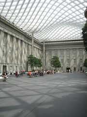
 Sunday was spent visiting a few other museums including the Renwick Gallery and the National Portrait Gallery, neither of which I had been to before. The Renwick, sitting at the corner of Pennsylvania and 17th, just across the street from the White House, had a delightful collection of American folk art. At the National Portrait Gallery I enjoyed seeing the infamous presidential portraits and WPA era paintings. In the middle of the museum is an enclosed courtyard (see image to left) with a beautiful undulating glass and steel ceiling. Designed by Norman Foster and constructed in 2004, it reminded me of the Great Court at the British Museum in London, also designed by Foster. Despite being an extremely hot day outside, inside the courtyard was very comfortable. With a cafe and lots of seating it would be a pleasant atmosphere to have lunch or meet someone for conversation.
Capitol Hill
That afternoon we took a walk around the neighborhood of Capitol Hill, stopping by the recently reopened, historical Eastern Market which was severely damaged by a fire in 2007. Inside the building is mostly meat counters and perishables, while other market vendors set up along the exterior and a parking lot across the street. The market was closing up for the day, but I managed to get inside behind two other explorers to see the refurbished space. We then headed further east along residential streets. Away from Pennsylvania Avenue the neighborhood is almost entirely residential, with a few corner stores, laundromats, etc. every here and there.
 Nearly all the housing here is in townhouses, mostly attached. Unlike older neighborhoods like Georgetown and remaining houses closer to downtown, this area had a little more room to breath. On many streets the houses were actually set a good distance (10-25 feet) from the sidewalk so they had private front yards. We all agreed it would be a nice place to live. It has historic charm with strong urban qualities, but calm streets with tree shaded sidewalks.
On our way back toward downtown we walked a few blocks north up to H Street NE, where rail tracks are being laid for one of DC’s new streetcar lines. H Street is a wide, commercial street with a mix of large and small storefronts, some newer strip centers, and an unsightly public storage facility. Most businesses were gated up and closed for Sunday. Despite its seedy appearance, H Street is up and coming, and the streetcar line should help accelerate even more improvements.
Rosslyn – Ballston Corridor
Monday morning I went on my own to explore the Rosslyn-Ballston corridor in Arlington. I took the Metro out to Ballston and then started walking. As walking around became tiring, particularly in the 90 degree heat, I grew apathetic to explore much more. The massive extent of metropolitan sprawl here clearly can not be comprehended with one week visiting and walking around. Outside of the District, the non-gridded, non-contiguous urbanized region goes on for miles. There are many instances of urban form outside the city, some new and artificial, and some long established. It is a very different scene than metropolitans, large and small of the midwest. Admittedly, I would love to be able to drive all around this area in a car just to get a better comprehension of what the many places and spaces in between are like. Looking at a map or even satellite images is simply insufficient to grasp, and one certainly could not see everywhere by transit either.
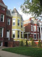
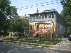
 Most of the large office buildings are clustered within 2-3 blocks to a few major thoroughfares. Despite wide, busy roadways there are wide sidewalks with decorative streetscaping, a good amount of pedestrian oriented ground-level businesses, and a general feel of real urbanism. In a couple places I strayed off the main road by a few blocks to see the “real Arlington” where large office buildings quickly transitioned into single-family residential. A lot of the houses were characteristic of mid 20th century East-coast suburban development, mostly with brick veneers in reverence to the more traditional Colonial Revival style. On other streets, though, homes were more characteristic of late Victorian and craftsman, that are common in older neighborhoods around the midwest. Some homes appeared to be renovated or possibly completely new, some keeping with the craftsman style, with others more contemporary, as pictured to the right.
I met back up with Spencer around lunchtime, while Cece was spending more of the day visiting museums. We went up to U Street for lunch and continued walking north passing through Meridian Park, all the way to Columbia Heights Metro. The station is located by a major retail center on 14th Street NW. The DC USA development includes a Target store, Best Buy, Staples, and fitness club among other stores and restaurants. I have always found big box retailers in urban contexts very interesting, so this was fun the check out. Target seems to be leading with many urban stores around the country, and inventive architecture at their newer suburban stores as well.
Silver Spring
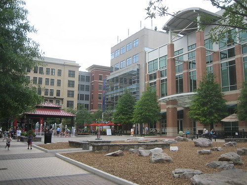
After this we hit up Silver Spring, another major “downtown” in the region, just outside the northern limits of DC. Silver Spring, along with Bethesda, is one of the shining stars of Montgomery County, Maryland. Amidst more single family housing, the urban business district merges subtly with surrounding neighborhoods. A major destination is “Downtown Silver Spring”, a former enclosed shopping mall that has been mostly redeveloped into urban blocks of retail storefronts. A plaza area and fountain on Ellsworth Drive, the mainstreet of “Downtown” acts as a centerpiece. But downtown Silver Spring is much more than this shopping mall disguised as authentic urbanism with many additional businesses, restaurants, and housing in new and old buildings.
Near the “Downtown” shopping area, an open half-block lot had been artificial grass turf for a few years and was quite successful as public space, where people gathered and children played. I remember visiting the turf in 2007, and was surprised by how active it was. Now the site is under construction for a new Silver Spring Civic Building on the far end of the site with a Veterans Plaza in place. The plaza will act in many ways like the turf did, as a public space for people to gather informally and for events, such as the Silver Spring Jazz Festival. It should be noted Silver Spring is not actually an incorporated city and is governed by Montgomery County. There are few incorporated cities in Maryland’s Montgomery and PG counties that surround the District, but many places are considered towns or cities informally, such as Silver Spring.
National Cathedral
Tuesday, our last day in DC, we took a tour of the National Cathedral in northwest DC. It is an incredible building with several unique and characteristically American quarks. While most cathedrals were built hundreds of years ago, this one was only completed in 1990, after a long construction span of 83 years. Imagery and symbolism represent not only historic Christian stories and ideals, but also include modern elements of national and cultural significance. For example there is one stained glass window illustrating the solar system with a real moon rock brought back on Apollo 13. Also there is a discrete gargoyle of Darth Vader, expressing pop culture contemporary with the cathedral’s construction.
The cathedral is not directly adjacent to a Metro station, so it afforded us a short walk through a quiet residential area from the Cleveland Park station to the east. The walk back was quite a bit longer with a missed turn on the way to the Woodley Park – Zoo station, one stop south of Cleveland Park, for reasons none other than to see something different than the walk there. Nevertheless it was interesting to see a less dense, yet undoubtedly stately residential area of Washington.
Rockville Town Square
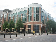
When back to the Metro, we rode up to Rockville, a few stops out into Maryland. I was interested in seeing the Rockville Town Center redevelopment that commenced in 2004, to replace a long ailing shopping center that in a previous decade replaced the city’s original downtown in the name of urban renewal. Much of the mall was torn down, with parts of it remaining that include a row of restaurants and a movie theater, though it’s not obvious to the unknowing visitor that it used to be a mall. Phase 1 of the town center project was Rockville Town Square, a four block area that has been built up with urban-scaled buildings connected with the existing town street grid with a wonderful public plaza as its focal point.

The view from the Rockville Metro station gives no indication of a walkable, welcoming urban space just a few blocks away. The Rockville Pike thoroughfare creates a minor barrier, along with a large, bland concrete office complex. A semi-enclosed pedestrian bridge over the road at least provides a safe means to cross on foot. We actually crossed the road on foot, not knowing exactly where the town square was, and passed the large office structure to where you could get a glimpse of something more humane and inviting. From our approach, we first came to the old mall remanence containing some restaurants and cinema, a block before the actual brand new development. I could tell this strip wasn’t as new as the town square developments. Across the street from the restaurant row is a large parking lot taking up the entire block. New buildings in the town square development were on the other side of the parking lot, so we headed in that direction.
The actual Rockville Town Square plaza is surrounded by the new buildings, all around five stories tall, so it is almost hidden. The new buildings stand in pretty stark contrast with existing Rockville Buildings that are mostly bland concrete boxes and towers. One calmer city street goes right through the town square development, where it becomes much more decorative and pleasant. With relatively narrow street widths and buildings built up to the sidewalk, the town square is revealed and opens up as you approach it.
 The square was quite active today. There were a few restaurants facing the square with outdoor seating. Others were eating or just relaxing on one of the many benches and seats. Kids were playing in the fountain. We got burgers at a Five Guys and ate on one of the benches. Besides retail and restaurants, and of course apartments and condos on upper levels, a major tenant at the town square is the Rockville Public Library, also in a brand new building. The two-story library building is situated at the corner of the plaza next to the one traversing street. At the corner on the first level is a restaurant. The actual library entrance is on to the square. Inside is a large two story atrium with stairs to the second level. One exterior facade is undulating, giving the library a fun and modern aesthetic, standing out from the other more traditional looking buildings around the square.
I really enjoyed visiting Rockville Town Square. Despite being brand new, it felt mostly like real city streets, real public space, not like a corporate “town center” shopping mall or completely separated New Urbanist development. With that, it felt a little hidden away behind larger, existing buildings and barriers like the Rockville Pike. Also since the town square is almost fully enclosed by new stylized buildings, it seems almost isolated from the rest of the actual city. But if this form of redevelopment continues I imagine it could provide a better connection between the square and surrounding neighborhoods. I look forward to visiting Rockville again someday.
Overall another enjoyable visit to DC and surroundings, though my past two visits were in March, so I wasn’t quite ready for the extreme heat and humidity. I think DC would be a neat place to reside someday, so whenever I visit I try to see different places and experience what it could be like to live there. I like to see the different neighborhoods and different lifestyles they encourage, because the city is much more than monuments.
See all photos from the trip on Flickr. By the way, the title of this post refers to this.
